






Breaking News
 Megyn Kelly on the Totalitarian Absurdity of the Cornell 7 "Rape" Case
 The Global Credit Reset Is Here (and Why Silver is Next)
 6 of the WORST Frugal Living Hacks Ever
 The New World Map the UN Wants You to Use
Top Tech News
 Seven apps. One craft
 SHOCK CASE REPORT: Advanced Alzheimer's Patient Regains Speech, Memory, Mobility...
 Most artificial limbs rely on silicone or plastic to mimic human hands.
 Flying cell tower beams phone signal to Japan from 10 miles up
 Chinese Commercial Reactor Achieves Nuclear Fusion with Clean Hydrogen-Boron Fuel
 Med Beds Just Took a MASSIVE Step Forward, Healing People in Days!
 Palmer Luckey: Autonomous Weapons Are Ancient and Why Anduril Won't Build Humanoids | EP #295
 A laser just photographed objects through six feet of concrete
 Elon Musk's Next-Gen Motor Destroy Entire EV Industry
 China's disputed satellite refueling heralds new space war era


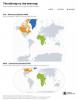
The New World Map the UN Wants You to Use
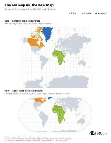
The icon map was designed to make navigation on the Earth's oceans easier, but it came with a cost: the farther a place lies from the equator, the more dramatically its size is exaggerated.
On Sept. 4, 2026, the United Nations General Assembly endorsed the Equal Earth projection, an equal-area world map published in 2018, and encouraged governments, schools, media, and technology platforms to use it wherever the comparative size of continents matters.
The graphic above shows that map, using the free Equal Earth wall map published by cartographer Tom Patterson, one of the projection's three creators, with vote details from UN resolution A/80/L.104 and the UN's meetings coverage.
The Old Map vs. the New Map
Every flat map has to give something up, and the two below make different trade-offs.
Mercator, on top, keeps compass bearings straight and pays for it in area, stretching land more as it approaches the poles. Equal Earth, beneath it, keeps area exact and lets shapes bend slightly instead. Africa, Canada, and Greenland are highlighted on both so you can see what happens to each when the projection changes.

Gerardus Mercator designed his map in 1569 for sailors. A straight line on it follows a constant compass bearing, which made it indispensable at sea and, much later, useful for seamless online maps.
The trade-off is that it stretches the world more and more as you move away from the equator. At 60° north, roughly the latitude of Oslo or Anchorage, land is drawn four times too large. At 80° north, it is drawn 33 times too large.